VMware Aria Operations for Applications (formerly known as Tanzu Observability by Wavefront) supports histograms for computing, storing, and using distributions of metrics rather than single metrics. You can send histograms to a Wavefront proxy or use direct ingestion.
You can find histogram metrics in the histogram browser and query for them using an hs() query. You can also visualize histograms different chart types.
View Histograms in the Histogram Browser
You can view histograms in the Histogram browser.
- Click Browse > Histograms and start typing the histogram metric name.
Each histogram metric has an extension .d, .h, or .m. If you sent a metric in histogram data format, the extension corresponds to the interval you specified (
!M,!H, or!D). If you sent a metric using Operations for Applications data format, the extension depends on the histogram port that you used. -
Select the metric you’re interested in.
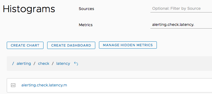
- Examine the chart.
- The query is an
hs()query, not ats()query. - We display the median for histogram metrics by default. You can use
percentile(<value>, hs(<expression>))to retrieve other percentiles.
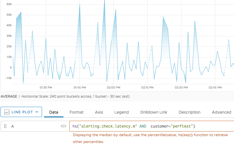
- The query is an
Query Histogram Metrics
You can display histogram information in any chart.
- If you’re using a time-series chart, we apply the
median()function to the histogram. We implicitly wrap amedian()function around thehs()function and display the median value of each distribution as a time series: - For the Histogram chart and Heatmap, we directly display histogram information.
You use the hs() function with the name of a histogram metric to access the histogram distributions for that metric. A histogram metric name has an extension .m, .h, or .d:
- If you sent distributions in histogram data format, the histogram metric extension corresponds to the interval you specified (
!M,!H, or!D). - If you sent metrics using Operations for Applications data format, the histogram metric extension corresponds to the histogram port that you used.
When you run an hs() query, you can optionally use it with one of the histogram to histogram functions.
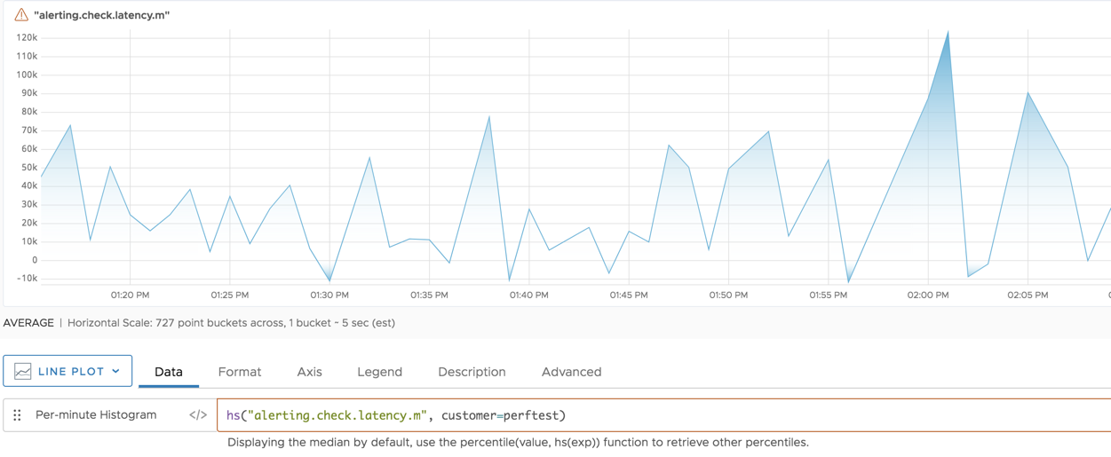
Visualize Histogram Metrics in Time-Series Charts
It’s possible to visualize histogram distributions in a time-series chart such as a line chart.
Default with Implicit median() Function
We implicitly wrap a median() function around the hs() function. You can use additional functions such as percentile() with hs().
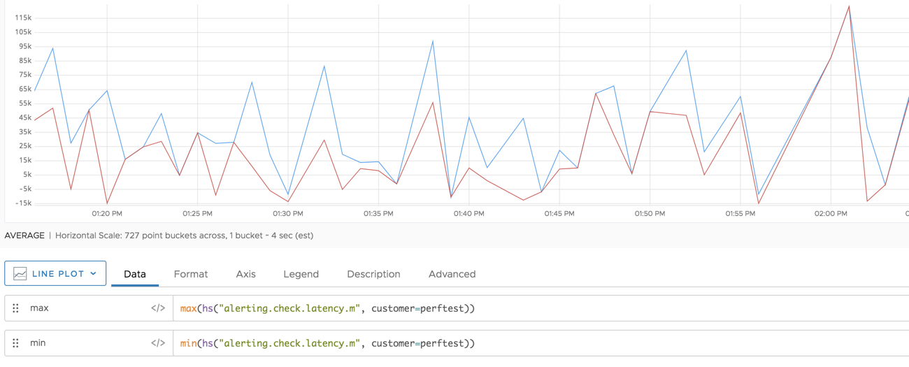
Explicit Use of Other Functions
You can explicitly wrap another histogram function around the result of hs() to see other information. For example, the 2 histogram queries in the following chart display the maximum and minimum values from each histogram distribution:
Histogram Summary Information
Sometimes it is useful to see more information about a histogram than just the median or any single percentile. You can use summary() or alignedSummary() to display all of the following percentiles from the histogram data: max, 99.9, 99, 95, 90, 75, avg, median (50), 25, and min.
The following diagram shows the information you get for the metric shown above if you wrap it with summary(). The legend lists the series that are extracted from the histogram data by default.
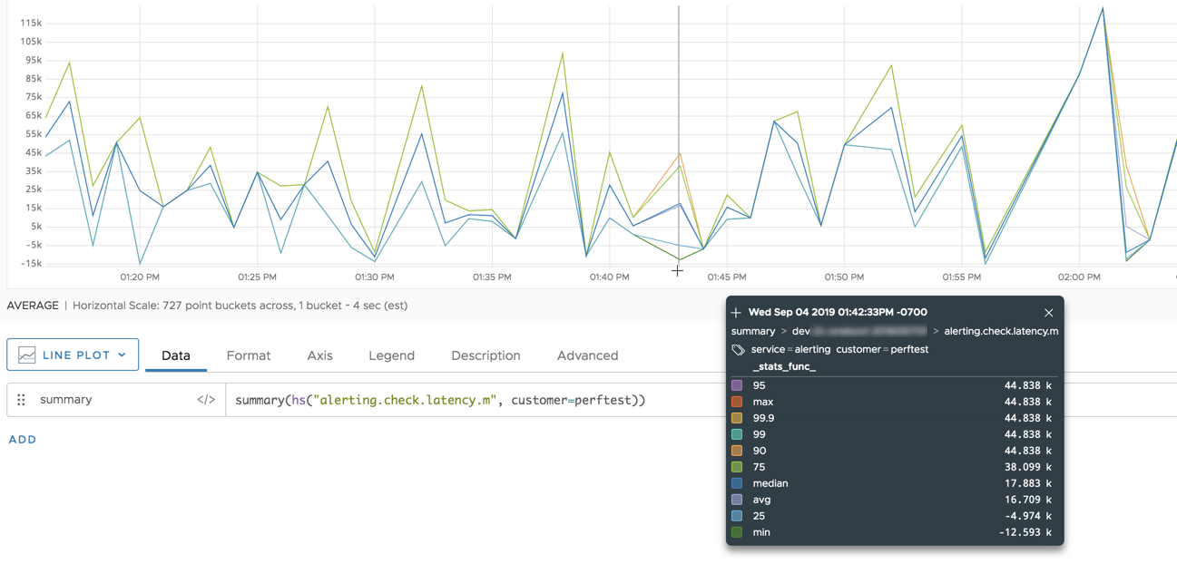
You can extract just the percentiles that you are interested in, by calling the function with an optional list of percentages as the first argument. For example, the following function returns the 10th and 25th percentile from each histogram distribution in the series:
summary(10, 25, hs("alerting.check.latency.m", customer=perftest))
Visualize Histogram Distributions in a Histogram Chart
Histogram charts are designed especially for histogram visualization:
- Each bar shows one time slice.
- X axis shows what I’m recording, for example, latency.
- Y axis shows distribution values. This is what I’m recording, for example, latency.

Histogram charts are interactive. Hover legends give details, and you can go from the ellipsis in the top right to the trace browser for the histogram:
- Add histogram queries in Chart Builder or Query Editor.
- Use an
hs()query to visualize data that were ingested as Operations for Applications histograms. - Use a
ts()query to visualize any data as histograms.
- Use an
- Set the Y axis dimensions and X axis minimum, maximum, and units.
- Select percentile markers to display.
- Customize the color gradient.
- Examine each histogram bar with hover text.
- Drill down to a corresponding chart from the menu in the top right.
See the chart reference for histograms for details.
Visualize Histogram Distributions in a Heat Map
Histogram distributions expand on the functionality of histogram charts by allowing you to examine your histograms in 3 dimensions:
- X axis shows time (as in most charts)
- Y axis distribution values (as the X axis in histogram charts). This is what you’re recording, for example, latency.
- Z axis (color saturation) shows density, that is how many values are in this field.
The following diagram uses the same query as the histogram chart above.
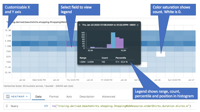
The heatmap is interactive and lets you examine the histogram in detail.
- Add histogram queries in Chart Builder or Query Editor.
- Use an
hs()query to visualize data that were ingested as Operations for Applications histograms. - Use a
ts()query to visualize any data as histograms.
- Use an
- Hover over any field to bring up a legend. The legend:
- Shows how this histogram bar fits in with the rest of the histogram using a contrasting color.
- Includes information about the range, count, and percentile. Use Shift+P to pin the legend.
- Click the ellipsis in the to right to go to the Traces browser for this histogram distribution.
- Change the time, X axis, or Y axis to customize what you see.