VMware Aria Operations for Applications (formerly known as Tanzu Observability by Wavefront) includes a variety of charts, with many customization options. Create and Customize Charts describes most of the things you need to know to get started. This page has some special tips and tricks to help you create the user experience you’re after.
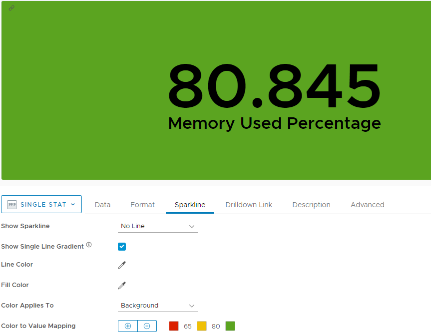
How Do I Set Up Color Mapping?
Color mapping is a powerful way to get users’ attention when there’s a problem. We support color mapping for the following charts:
- Single stat
- Gauge
- Topk
- Node map
- Pie
The following example shows how to use color mapping with a single stat chart.
|
 |
Why the Color Can Be Different from What I Expect?
In some cases, the color on a chart, for which you have set color mapping, can be different from what you expect to see. This can be caused by the decimal precision value that is set on the chart. When you use color mapping, Operations for Applications considers the real values in the system and changes the colors accordingly, while the values displayed on the chart can be rounded because of the decimal precision that is set on the chart.
Consider the following scenario:
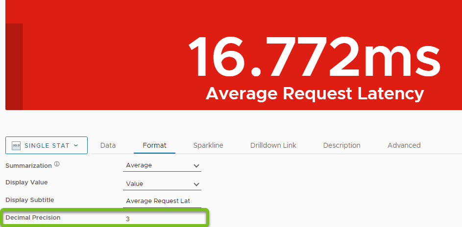
| You have a created a single stat chart to monitor the average request latency. The chart has been in yellow state for quite a long time, showing value of 16.77ms. | 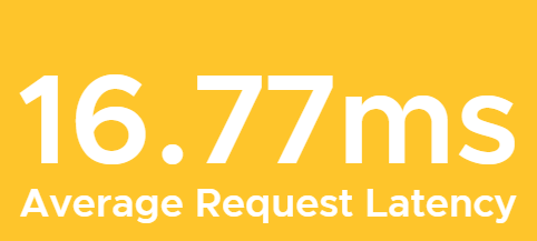
|
| At some point in time, the value on the chart still shows a value of 16.77ms but the color changes to red. | 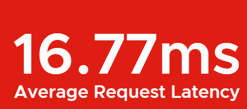
|
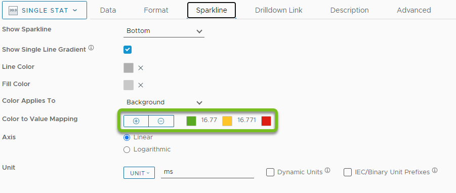
When you check the Color to Value Mapping setting on the Sparkline tab, you see the following color mappings:
|
 |
|
Then, you click the Format tab on the chart and check the value in the Decimal Precision field. In our example, the value is set to |
 |
How Do I Set Up Thresholds for Histograms and Heat Map Charts?
Histograms let you compute, store, and use distributions of metrics rather than single metrics. Heat map charts add another dimension to the information about histograms that you see in a histogram chart.
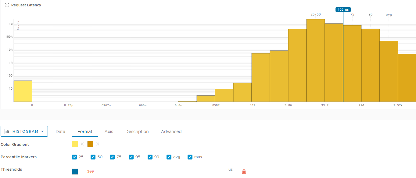
You can apply threshold markers for the data represented by histogram and heat map charts. The markers that you provide can be either a constant value or a variable that is defined by a query expression. The following examples show how to set up thresholds for a histogram chart.
-
On the Data tab, specify the metrics to monitor. For example:
merge(hs(tracing.aggregated.derived.*.duration.micros.m, ${aggregated_filters})) -
On the Format tab select the color gradient, specify the percentile markers, and click Add Threshold. You can do one of the following, or both:
- Enter a constant value as a threshold, for example
100us.
-
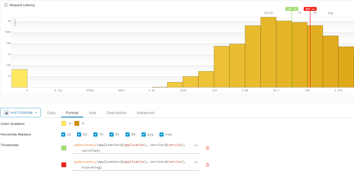
Enter a query expression as a threshold. The query must be in Wavefront Query Language. For example, you can enter the following queries as thresholds:
apdexLatency(application=${application}, service=${service}, satisfied)apdexLatency(application=${application}, service=${service}, tolerating)Note: You must make sure that the query that you enter returns a single stat series and that the query output can be captured as a threshold value.
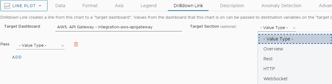
How Do Drilldown Links Work?
A drilldown link sends users to a target dashboard when they click on a chart.
- Drilldown on click is available for the following chart types:
- Single stat
- Topk
- Node map
- For all other chart types, drilldown is available from the ellipsis menu in the top right.
Simple Drilldown
In most cases, you want to send users from a chart to another dashboard or a dashboard section.
- Open the chart for edit and click the Drilldown Link tab.
- Start typing the name of the target dashboard and select from the options.
- (Optional) Select a target dashboard section and save the chart.
Drilldown Using Local Settings
You can optionally pass along a constant, point tag value, or other value to be used in the target dashboard. Here’s an example:
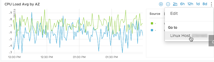
Suppose your users monitor 2 dashboards:
-
Dashboard 1 consists of a set of single stat charts that monitor important values and change color as critical thresholds are crossed for an availability zone. Each chart is for one availability zone only. Each chart sets the
azpoint tag to show only the value for that zone, for example: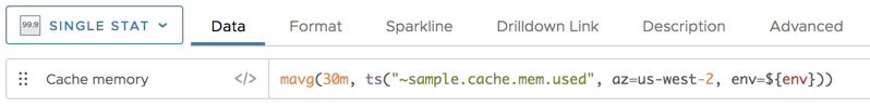
-
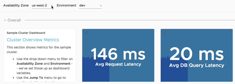
Dashboard 2 allows users to get details about the different availability zones. A variable (Availability Zone) is defined for that dashboard, and users can select a value for that variable.
You can set this up as follows:
- Inside dashboard 1, define a drilldown link for each single stat chart that:
- Goes to dashboard 2 when the user clicks one of the single-stat charts.
- Passes the value of the
azpoint tag in as the value of theazvariable.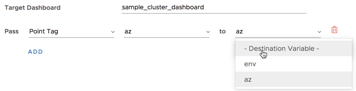
- When a user sees a critical value on a chart and clicks on that chart in dashboard 1, the user is redirected to dashboard 2, and the variable is preset to show the environment that has the problem.
Why Doesn’t the Outer Ring of My Gauge Change?
If you specify color mappings for a gauge chart, the inner ring of the chart will show the current value, and the color of that inner ring depends on the color mapping thresholds.
An additional outer ring shows how the colors map to the values 1-100 by default, even if the color mapping numbers are larger than 100. To specify where you want for the outer ring to start, specify a Min and Max value.
What Does the Summarization Option Do?
If the screen real estate dedicated to a particular chart cannot accommodate all raw data points in the current chart time window, the rendering engine uses the summarization option to aggregate raw data points into displayable values.
When displaying metrics:
- We first determine the chart resolution and establishes an appropriate time interval as the chart’s bucket size.
-
We then aggregate (combines) the raw data values that are reported within each such time interval (bucket) and produces a single value to display for each bucket. The chosen summarization option determines how the aggregation is performed.
- Average - Displays the average (mean) of the raw data values in each bucket.
- Median - Displays the median of the raw data values in each bucket.
- Min - Displays the minimum raw data value in each bucket.
- Max - Displays the maximum raw data value in each bucket.
- Count - Displays the number of raw data values in each bucket.
- Sum - Displays the sum of the raw data values in each bucket.
- First - Displays the first raw data value to be reported in each bucket.
- Last - Displays the last raw data value to be reported in each bucket.
Consider the following example. The horizontal scale for your chart is 240 point buckets across, 1 bucket – 30 sec (est). If you choose Median, the query engine aggregates the raw data values reported in each 30-second interval and displays the median value as the data point for that bucket.
When you fine-tune the time window, we dynamically recalculate and update the chart bucket size and the summarized values. You can zoom in the chart time window as much as needed to display the raw data points without any bucketing or summarization.
mmax() function, select the Max summarization option.For the chart legend, you can choose whether to report raw or summarized values by disabling or enabling the Non-summarized Stats option.
Learn More!
- Get the details about each chart type from the Chart Reference.
- Send a link of a dashboard to a coworker (or to the customer success team if you need help).
- Embed a chart in another product or website.