VMware Aria Operations for Applications (formerly known as Tanzu Observability by Wavefront) provides many different types of charts for examining data, creating alerts, and more! For example:
- Create a chart and fine-tune the data it displays using filters and functions.
- Customize your charts.
- Use chart variables, set the time window, create alerts, and optimize display speed.
Create a Chart
You can create a chart from a dashboard or from the toolbar.
Create a Chart from a Dashboard
|
 |
Create a Chart from the Toolbar
- Select Dashboards > Create Chart.
- (Optional) In the top left, specify a chart name.
- Select a metric and an optional filter and function.
- In the top right, click Save.
- Specify the dashboard in which you want to insert the chart or create a new dashboard.

Fine-Tune Chart Metrics from the Data Tab
From the Data tab, fine-tune the metrics that are displayed on the chart by customizing the query and applying filters and functions.
Chart Builder
Chart Builder lets you:
- Create a chart by selecting metrics or a chart type.
- Select one or more metrics directly or start with an integration.
- Specify filters and functions, e.g., to aggregate multiple time series.
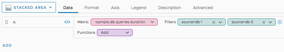
In the image below, we selected a metric, narrowed down the source, and we’re just selecting a function.
Query Editor
Instead of using Chart Builder, you can click the toggle and explicitly enter Wavefront Query Language expressions into the query field.
We can get the metric we selected above with the following query.
max(ts(~sample.db.queries.duration, source="db-1" OR source="db-5"))
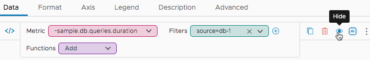
Hide, Clone, or Delete Queries
You can easily hide, clone, or delete queries from the Data tab.
|
 |
Customize How the Chart Looks
All users can set the chart time window and isolate sources and series without editing the chart. If you want you can also set the chart time window by editing the chart. The changes you make will not be affected by the changes to the dashboard time window settings.
Users with the Dashboard permissions can make many other changes, such as selecting the chart type or customizing the axes and colors. Here are some tasks you can perform. In many cases, they’re possible only for certain chart types.
Making changes to the UI, for example, changing the units, only affects the UI:
- Does not change the actual data values.
- Does not change the results of queries made with the API.
- Does not change constants used in queries, including thresholds.
Change the Legend
A chart renders the lines or points for different time series in different colors. The legend explains which color maps to which time series. You can change the legend to help users find the information they need, as follows:
|
Hover Legend For hover legends you can:
|
 |
|
Fixed Legend For fixed legends you can:
|
 |
For details, see the Chart Reference.
Include Metrics That Stopped Reporting
For optimal rendering of displayed results, charts and dashboards do not include obsolete metrics in charts. If you’re interested in including those metrics in a chart, it’s easy to do.
To include obsolete metrics:
- Open the chart for edit.
-
Click the Advanced tab and select the Include Obsolete Metrics check box,
Tip: To see the obsolescence period for your metrics and sources, hover over the Include Obsolete Metrics information icon. - Click Save.
You can also include obsolete metrics for all charts within a dashboard. See Set Dashboard Display Preferences.
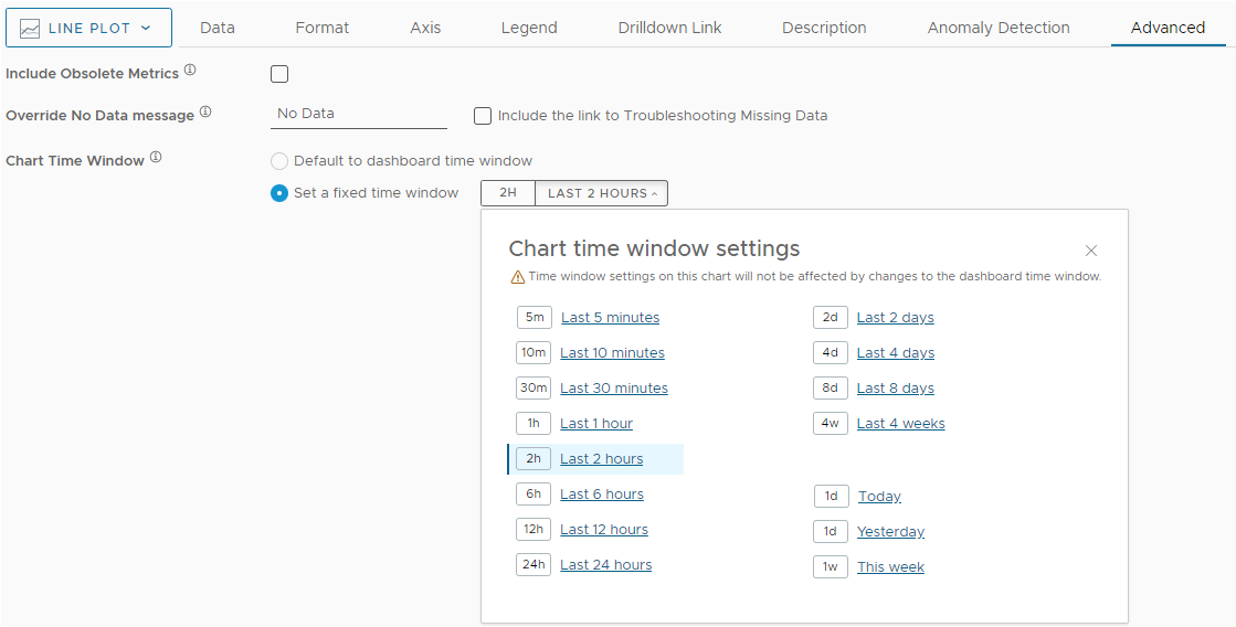
Set the Time Window on a Chart
You can set the time window on a chart to be defined on a dashboard level, or you can set a fixed time window on a chart. When you set a fixed time window on a chart and you edit the dashboard time window, the time settings of the chart will not be affected.
To set the time window on a chart level:
- Open the chart in edit mode.
- Click the Advanced tab.
- Click the Set a fixed time window radio button.
- From the time picker, select the chart time window settings.
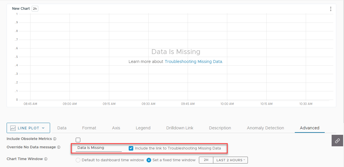
Override the No Data Message on a Chart
You can override the No Data message on charts when there is no data in the current time window and there are no errors in your query.
To override the No Data message on a chart:
- Open the chart in edit mode.
- Click the Advanced tab.
- Enter the message that you want to be displayed on the chart in the Override No Data Message text box.
- (Optional) Select to also display a link to the Troubleshooting Missing Data documentation page.
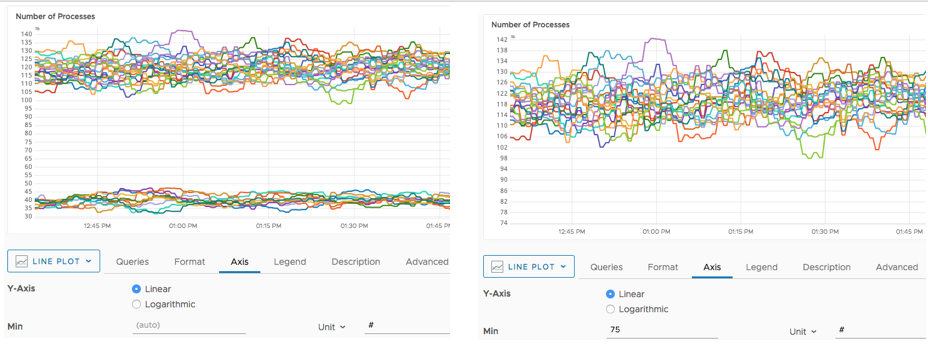
Use a Logarithmic Y Axis for Skewed Data
Sometimes charts have a few outliers that make it hard to make out the main part of a chart. For example, assume you have 10 standard servers and 2 large servers in your environment, and you monitor the CPU. With a linear scale, the large values for the large servers bunch together the lines for the standard servers.
To change the Y axis from linear to logarithmic:
- Open the chart for edit.
- Click the Axis tab and select Logarithmic.
Filter Out Lines with Min and Max
To filter out some lines, you specify a minimum or maximum. By default, we adjust the chart’s Y axis to show all information. The following screenshot shows the automatic Y axis on the left and a Y axis of 75 on the right to filter out all lines from the development environment.
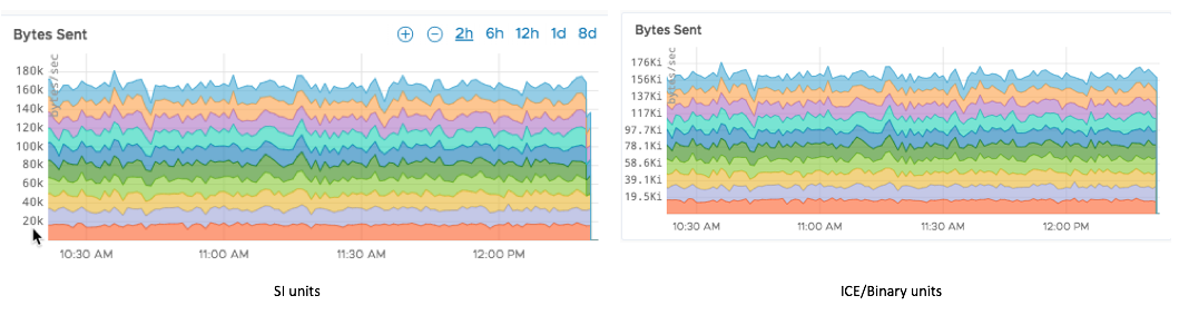
Use IEC/Binary Prefixes in Y Axis and Legends
You can control how units display in the Y axis. Changes affect only the display of data.
By default, charts use SI unit prefixes, but you can change that.
- SI unit prefixes (k, M, G, T, P, E, Z, Y) increment by a factor of 1000 and are used by default. For details on SI units, see Wikipedia or a similar source.
- IEC/Binary prefixes (Ki, Mi, Gi, Ti, Pi, Ei, Zi, Yi) increment by a factor of 1024.
To display axes and legends with IEC/Binary unit prefixes:
- Open the chart for edit.
- Click the Axis tab.
- For all applicable options (e.g., Min and Max), select Unit > IEC/Binary and pick the unit from the drop-down menu.
Going forward, a data point with value 1024 x 1024 = 1,048,576 displays as 1.000Mi instead of 1.049M.
Here’s how two charts might look:
Use Dynamic Units to Optimize the Display
Dynamic units adjust the scaling prefixes and units and result in a clearer display. The change depends on the type of metric and the corresponding unit.
SI or IEC/Binary Dynamic Units
When an axis is labeled with a unit that starts with one of the SI or IEC/Binary prefixes, the display logic:
- First normalizes the data value with the labeled prefix.
- Then assigns a new prefix and adjusting the unit.
For example, if an axis is labeled MPPS (Mega PPS, or 1 million PPS), and the underlying data has a value of 2000, the displayed value with Dynamic units enabled is 2.000B PPS and not 2.000k MPPS.
Options to show the underlying raw data are not affected - hold the Shift key to see the legend and the actual value.
Time Dynamic Units When an axis is labeled with a unit that exactly matches one of the time units, (ys, zs, as, fs, ps, ns, us, ms, s, min, hr, day, wk, mo, yr), the display logic keeps the magnitude as small as possible:
- First we normalize the underlying data to seconds.
- Then we display the data:
- If the normalized magnitude is < 60 results, the result is units ys through s.
- If the normalized magnitude is > 60, we scale the data using a larger time unit.
For example:
| Data | Axis Label | Display |
| 60,000 | ms (milliseconds) |
1.000 min |
| 60,000 | s (seconds) |
16.67 hr |
| 60,000 | us (microseconds) |
60.00 ms |
Chart Resolution
Our service accepts and stores data at up to 1 second resolution. Charts display that granularity only for small time windows on high-resolution displays. In most cases, data points are aggregated into time buckets and the buckets are mapped to display points based on the selected summarization option.
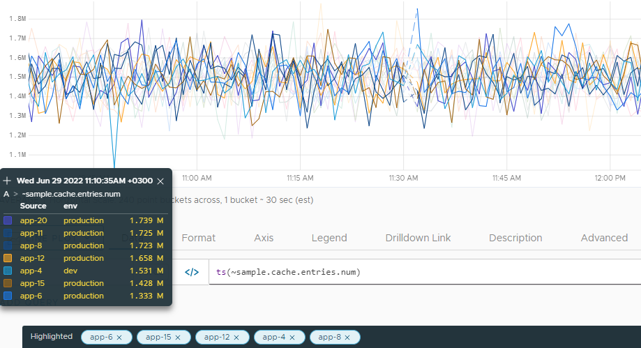
Chart resolution is the bucket time interval. It displays in the Horizontal Scale field in the lower-left corner of a chart.
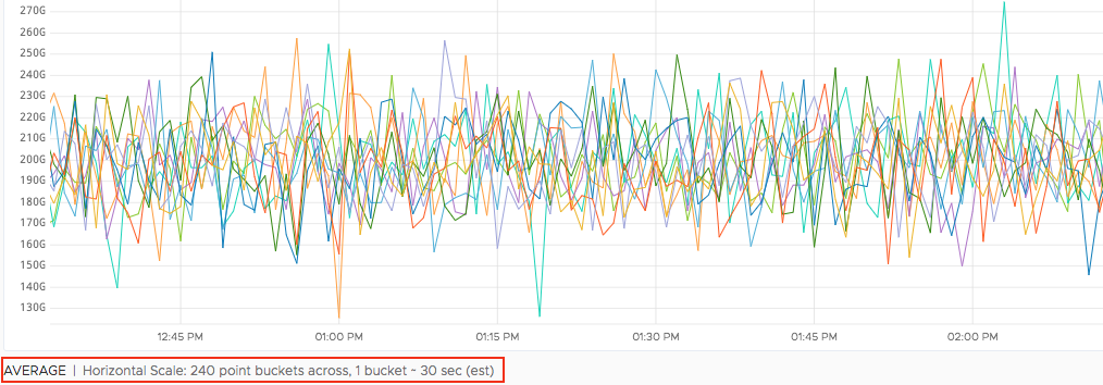
The chart above has 240 point buckets and the resolution of each bucket is 30 sec. If a source is sending 1 point per second, each bucket summarizes 30 points. On the other hand, if the source is sending 1 point every minute, no summarization occurs. If you choose the Count summarization method, you can see how many points are in each bucket.
Factors That Affect Chart Resolution
Chart resolution is determined by:
- The chart time window.
- The resolution of the display on which you view the chart.
Consider the following chart time window and display resolution examples, and the bucket size they typically have:
10 minute time window + 1280px display = ~1 second buckets (best resolution)
8 day time window + 3840px display = ~30 minute buckets (second best resolution)
8 day time window + 1280px display = ~60 minute buckets (third best resolution)
Larger time windows and lower display resolutions result in lower chart resolution.
Chart Resolution Example
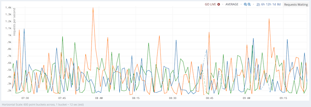
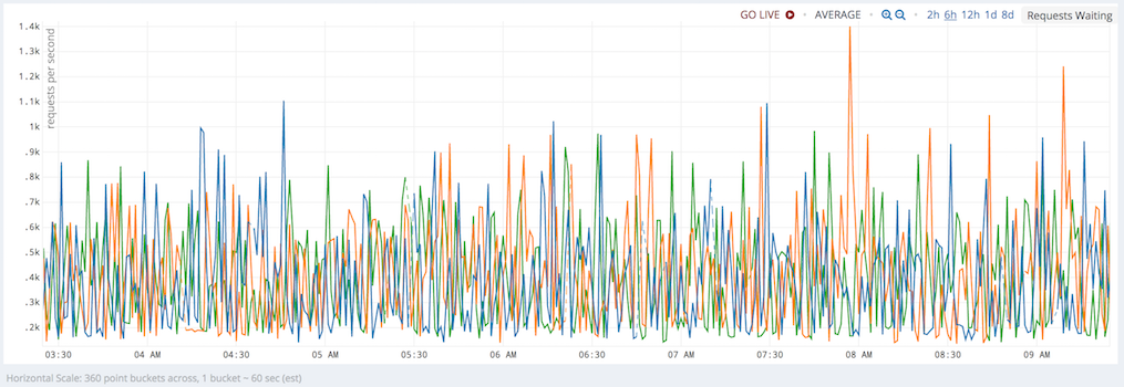
Here is a series of charts with increasing time window for the same display resolution (1280px).
- When the time window increases from 10 minutes to 2 hours (12 fold), the bucket size increases from 1 sec to 12 sec and the number of buckets remains the same.
-
In contrast, when the time window increases from 2 to 6 hours (3 fold), the bucket intervals increase from 12 to 60 sec (5 fold) and the number of buckets is reduced proportionately: 600 * 3/5 = 360.
-
10-minute window: 600 point buckets across, with ~1 sec buckets.

-
2-hour window: 600 point buckets across, with ~12 sec buckets.
-
6-hour window: 360 point buckets across, with ~60 sec buckets.
-
The align() Function and Resolution
The align() function lets you specify the size of the buckets—45 minute, 2 hour, 1 day, etc.—into which the points are grouped. However, the supported chart resolution is the most granular view you can get. Therefore, for the 1-week time window + 3840px screen example, specifying align(15m,...) does not result in 15 minute buckets being displayed on the screen because the ~30 minute buckets are already associated with the chart. If you were to use the align() function, the query service first aligns the values to 15 minute buckets, and then takes two aligned values and summarize those based on the Summarize By method.
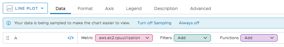
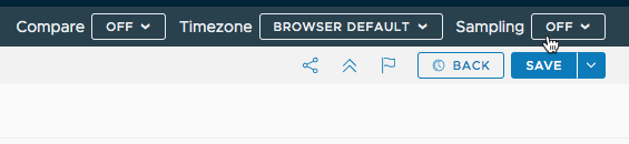
Improve Display Speed with the Sampling Option
It’s often not necessary to examine the complete set of time series. That’s why you can limit the number of time series to 100 for new charts.
To affect all dashboards, turn on Sampling in your preferences.
- Click the gear icon in the top right corner.
- Click your account name.
- Turn Sampling on.

If the Sampling preference is On:
- The maximum number of time series that’s displayed during chart creation or edit is 100.
- You’re prompted whether you’d like to turn off the limitation, as shown in the screenshot below.
- Turn off Sampling removes the limit for the current chart.
- Always off removes the limit for all charts.
To temporarily change the sampling behavior for a chart, use the Sampling menu in the top right. You cannot save this change (or other changes made through the options this toolbar).
Do More!
- Customize your chart. See the Chart Reference for details.
- Embed a chart in another product or on another website.