VMware Aria Operations for Applications (formerly known as Tanzu Observability by Wavefront) includes the Operations for Applications Usage integration. Use the Operations for Applications Usage integration dashboards to:
- Get usage information for your service instance and Wavefront proxies.
- Drill down into the metrics namespaces to discover trends.
- Examine the points per second (PPS) based on predefined ingestion policies.
- See whether the ingested metrics are at 95% of committed rate. Optionally, get alerts if that happens.
In addition, you can create your own dashboards, charts, and alerts by using the internal metrics to investigate a problem.
See Monitoring Wavefront Proxies for details on investigating proxy usage.
Learn About Your Usage with Dashboards
The Operations for Applications Usage integration includes the following dashboards:
| Dashboard | Focus | Description |
|---|---|---|
| Operations for Applications Service and Proxy Data | Examine usage data. | Provides visibility into your use of the Operations for Applications service via internal metrics that Operations for Applications collects automatically. Preconfigured charts monitor the data ingestion rate for points, spans, and distributions, the data scan rate, and different proxy metrics. |
| Operations for Applications Namespace Usage Explorer | Explore metrics namespaces to see the trend of your metrics ingestion rate. | Tracks the number of time series metrics received for the first 3 levels of your metric namespace. Also tracks the breakdown of histograms, spans, and delta counters. |
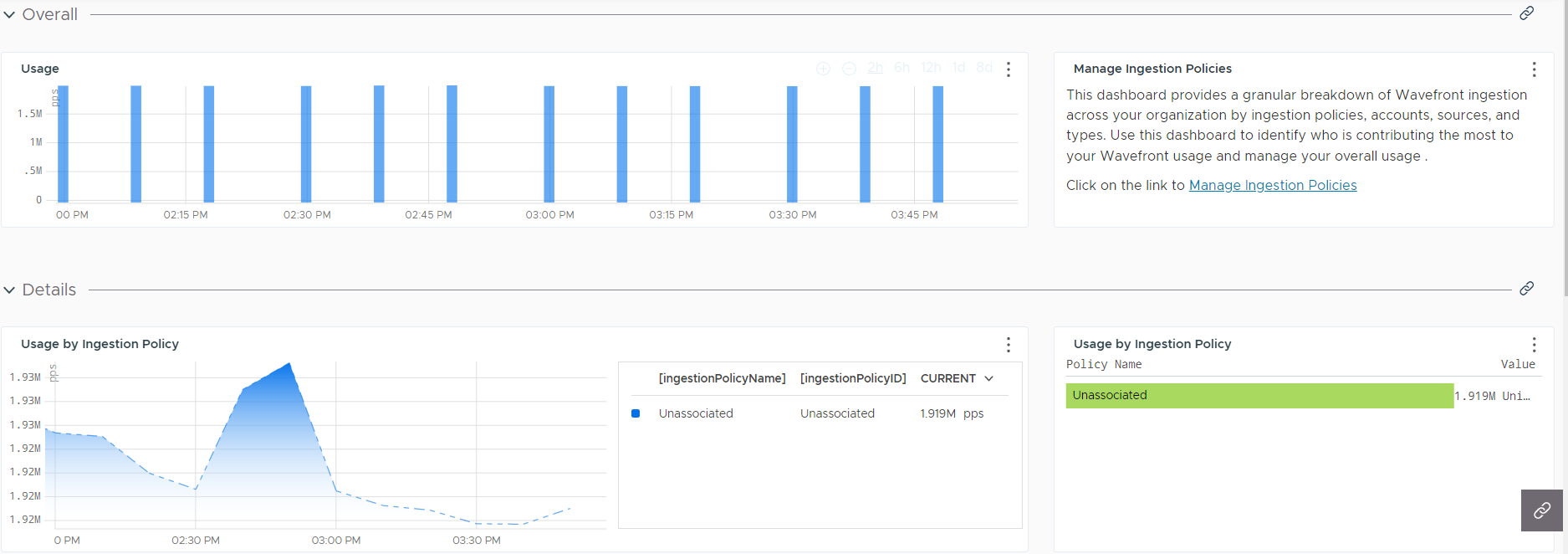
| Operations for Applications Ingestion Policy Explorer | In environments where ingestion policies are defined, investigate usage for each account and ingestion policy. | Provides a granular breakdown of the ingestion across your organization by ingestion policies, accounts, sources, and types. Use this dashboard to identify who is contributing the most to your usage and manage your overall usage of the Operations for Applications service. |
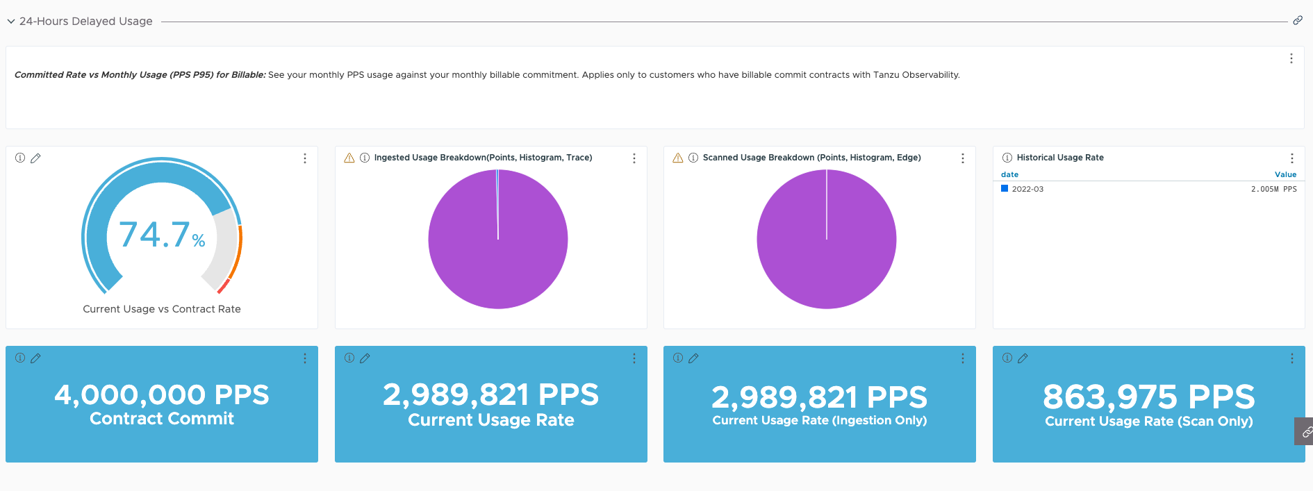
| Committed Rate vs Monthly Usage (PPS P95) for Billable | Avoid exceeding the monthly commitment for your instance by exploring dashboards and creating alerts. | Important: Use only if you have a billable commit contract.
Provides a detailed breakdown of your monthly usage against your monthly commitment. Enables you to take appropriate action when usage reaches around 95% of your monthly commitment. |
| Usage (PPS) vs Remaining Balance (PPS P95) for Burndown | Avoid exceeding the burndown commitment for your instance by exploring dashboards and creating alerts. | Important: Use only if you have a burndown commit contract.
Provides details about your usage against your remaining burndown balance and a breakdown of your usage per billing period. Enables you to take appropriate action when usage reaches around 95% of your burndown commitment. |
Operations for Applications Service and Proxy Data Dashboard
The Operations for Applications Service and Proxy Data dashboard helps you find reasons for system slowdown.
The charts show internal metrics information and allow you to examine many aspects of your Operations for Applications instance. See Monitoring Wavefront Proxies for details on the Proxy Overview and Proxy Troubleshooting sections.
Overall Data Rate
The Overall Data Rate section shows the overall point rate being processed by the Operations for Applications servers.
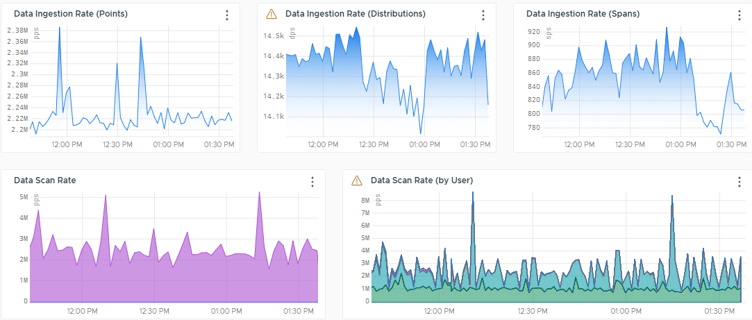
These charts use the following metrics:
- Data Ingestion Rate
~collector.points.reported– Points coming from the proxy.~collector.direct-ingestion.points.reported– Points coming through direct ingestion.~collector.delta_points.reported– Delta counter points.~externalservices.<*>.points– Per-second rate at which cloud integrations, such as AWS, GCP, and Azure, ingest new points.
For example, use
~externalservices.ec2.pointsfor the EC2 points.externalservices.points.reported– Shows how you get billed for external services.
- Data Scan Rate
~query.metrics_scanned– The per-second rate at which metrics are being queried through dashboards, custom charts, derived metrics, or API calls.~query.spans_scanned– The per-second rate at which spans are being queried through dashboards, custom charts, or API calls.~query.histograms_scanned– The per-second rate at which histograms are being queried through dashboards, custom charts, derived metrics, or API calls.
Logs Stats
The Logs Stats section contains charts that track the amount of logs that are successfully delivered and successfully queried by the Operations for Applications service. Also, the section shows charts that track the amount of logs that are received, queued, and blocked by the proxy.
These charts use the following metrics:
~proxy.logs.*.delivered– Number of log bytes successfully delivered.~wavefront.logservice.api.bytesQueried.total.bytes– Number of log bytes successfully queried.~proxy.logs.*.received.bytes– Number of log bytes received by the proxy.~proxy.logs.*.received.max-burst-rate– Maximum burst rate of incoming logs.~proxy.buffer.logs-count– Number of delayed log bytes stored on disk. Logs can be queued for the following reasons:- Intermittent failures in communication with the backend.
- A surge of incoming data in excess of thread buffer size.
- Memory pressure in the proxy.
- Rate limiting.
~proxy.logs.*.blocked– Number of log objects blocked by the preprocessor.~proxy.logs.*.queued– Number of queued log bytes.
Operations for Applications Stats and Alert Stats
Charts that track the number of users during various time windows, the number of dashboards and alerts, and also provide information about the state and types of alerts.
These charts use the following metrics:
~wavefront.alerts.*– Count, states, and types of the alerts.~wavefront.dashboard.*– Metrics related to the number of dashboard views.~wavefront.dashboards.*– Total count of the dashboards, number of the custom dashboards, and number of deleted dashboards.~wavefront.maintenancewindows.*– Number of the active and future maintenance windows, as well as the total number of maintenance windows.~wavefront.serviceAccounts.*– Number of the active, inactive, and deleted service accounts.~wavefront.users.*– Metrics related to the user accounts and their activities.
Ingest Rate by Source
The Ingest Rate by Source section gives insight into the shape of your data. It shows the total number of sources reporting. It also monitors the rate of metrics creation and breaks it down by source.
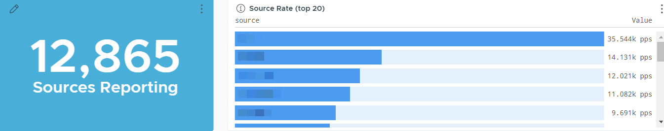
The metrics used in this section are:
-
~metric.counter– Number of metrics being collected. Does not include internal metrics.If you’re interested in histogram ingestion by source, clone this dashboard and add a chart that uses the
~histogram.countermetric. -
~histogram.counter– Number of histograms being collected. Does not include internal histogram data.
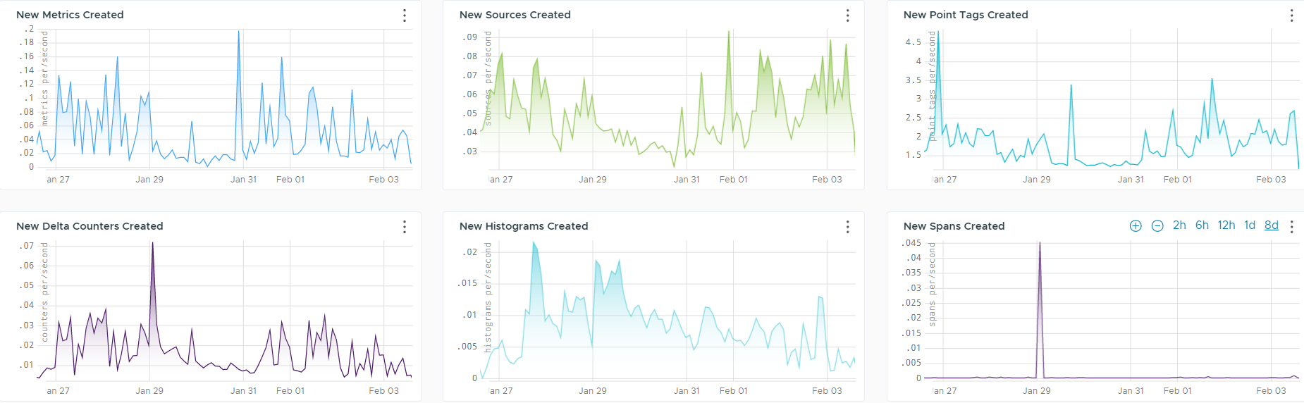
Rate of New Data Creations
The Rate of New Data Creations section gives an insight into the newly created data, such as metrics, sources, point tags, delta counters, histograms and spans.
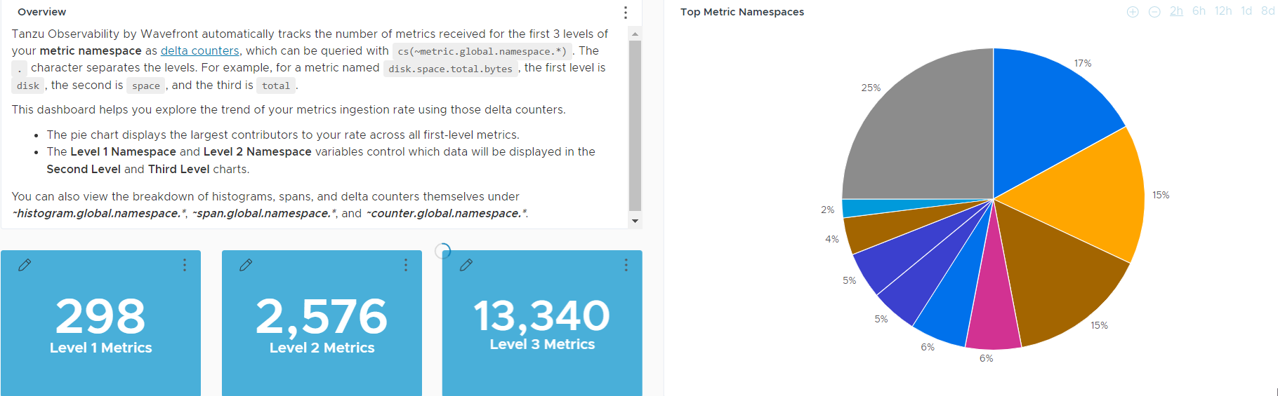
Operations for Applications Namespace Usage Explorer Dashboard
This dashboard helps you drill down into the metrics namespace and explore the trend of your metrics ingestion rate.
Operations for Applications automatically tracks the number of metrics received for the first 3 levels of your metric namespace as delta counters, which can be queried with cs(~metric.global.namespace.*). The period (.) character separates the levels. For example for a metric named disk.space.total.bytes, the first level is disk, the second is space, and the third is total. This dashboard includes chart to explore those metrics and trends.
Operations for Applications Ingestion Policy Explorer Dashboard
This dashboard helps you investigate the usage of the Operations for Applications service for each user and ingestion policy.
Operations for Applications supports creation of ingestion policies. You create policies and assign accounts (user or service accounts), groups, sources, namespaces, or point tags to each policy. On the Operations for Applications Ingestion Policy Explorer dashboard, you can examine which policies use which part of the total ingestion. You can even drill down and examine usage of individual users.
The dashboard includes a link to the Ingestion Policies page, so you can examine the ingestion policies in your environment. If you are a Super Admin user, you can also create and modify ingestion policies.
PPS P95 Dashboards for Billable and Burndown
- If you have a billable commit contract, use the Committed Rate vs Monthly Usage (PPS P95) for Billable dashboard.
- If you have a burndown commit contract, use the Usage (PPS) vs Remaining Balance (PPS P95) for Burndown dashboard.
The dashboard for your contract type helps you monitor your usage and ensure that you’re not ingesting more PPS than your contracted rate allows.
-
The Committed Rate vs Monthly Usage (PPS P95) for Billable dashboard provides a detailed breakdown of your usage against commitment per billing period.
-
The Usage (PPS) vs Remaining Balance (PPS P95) for Burndown dashboard provides visibility into your usage against burndown commitment and a detailed breakdown of your usage per billing period.
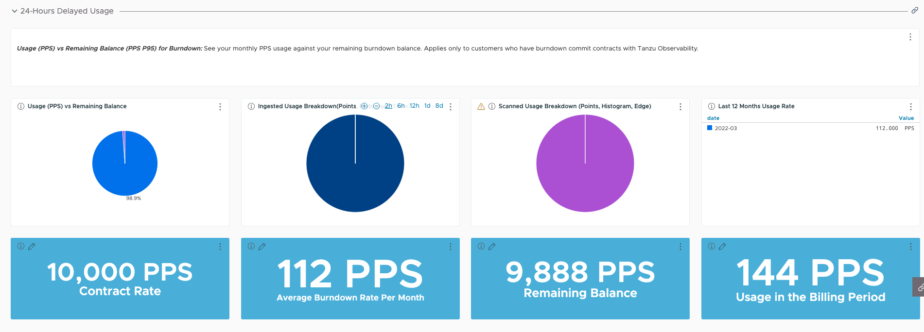
When your usage reaches around 95% of your committed rate, you can then take appropriate action. For example:
- Examine who is using a high percentage of the PPS in the Operations for Applications Ingestion Policy Explorer dashboard.
- Implement ingestion policies and examine who is using a high percentage of the PPS.
Scenario: Avoid Exceeding the Committed Rate
Customers often tell us that they want to make sure they don’t exceed their committed monthly PPS (points per second). Follow these steps to monitor usage and take corrective action.
- The Committed Rate vs Monthly Usage (PPS P95) for Billable dashboard includes charts that show how close you are to consuming 95% of your contracted rate. You can add alerts to charts in this dashboard to get notifications.
- If you need to reduce usage, you have several options:
-
Start examining ingestion from the Operations for Applications Service and Proxy Data dashboard.
The internal metrics shown in this dashboard highlight.
-
Use the Operations for Applications Namespace Usage Explorer dashboard to drill down into the metrics.
Operations for Applications automatically tracks the number of metrics received for the first 3 levels of your metric namespace as delta counters, and this dashboard presents the metrics in an easy-to-use way.
- Examine the overall usage of your Operations for Applications service.
- Finally, if you suspect that much of your usage comes from certain accounts (user or service accounts), consider setting up one or more ingestion policies.
-
Learn More!
- Find Actionable Usage Information explains how to use tools and dashboards to learn how much data is coming in, who is sending the data, how to get alerted if ingested data get close to monthly contracted usage, and how to optimize your ingestion rate.
- Metadata (Label Manipulation) Functions explains how to rename metrics and sources and create point tags with
aliasSource,aliasMetric, andtaggify.]