VMware Aria Operations for Applications (formerly known as Tanzu Observability by Wavefront) provides charts viewing and examining your data. You can interact directly with charts in real time – zoom in, zoom out, change the time window, and so on.
Users with dashboard permission can customize many aspects of the chart and save their changes. This page is a detailed reference to the tabs in the different chart types. We repeat tab reference for each chart type.
Data Tab (All Charts)
For each chart (with the exception of a Markdown and Logs Table chart) you specify one or more queries.
When you click Data, you can:
- View queries for the chart and add lines.
- Use Chart Builder or Query Editor.
- Clone, delete, or hide one or more lines.
- Create an alert based on a chart.
Line Plot Chart

Line plots are well suited both for single time series and multiple time series. You can customize many aspects of your line plots.
A line plot represents interpolated point buckets. The X axis represents the amount of time in your time window and the Y axis represents the value associated with the data based on that time.
Missing data is represented by a dashed line. The dashed line only gives a visual representation of the data stream; it does not represent values of the missing data. If you hover over the chart, you won’t see values where the gap threshold has been applied. Use the Format > Gap Threshold property to set the amount of time before gaps of missing data display as dashed lines.
Format Tab
| Option | Description |
|---|---|
| Summarization | The summarization option is used by the query engine to aggregate raw data points into displayable values. Consider the following example. The horizontal scale for your chart is "240 point buckets across, 1 bucket – 30 sec (est)". If you choose Median, the query engine aggregates the raw data values reported in each 30-second interval and displays the median value as the data point for that bucket. |
| Display Source Events | If checked, displays events that were generated by alerts associated with any source displayed on the chart. You can also use events() queries to Display events in charts. |
| Gap Threshold | Controls when data is considered missing when there are gaps in the reporting of the data. The gap threshold is expressed in seconds and defaults to 60 seconds. |
| Show Single Line Gradient | Allows you to turn off or turn on the single line color gradient when you're looking at a line chart and you have only a single line. |
| Decimal Precision | How many digits to show after the decimal point. Defaults to 3. |
Axis Tab
The Axis tab lets you customize the Y axis. The customization is the same for both Line Plot and Point Plot. See Use a Logarithmic Y Axis for Skewed Data and Use IEC/Binary Prefixes in Y Axes and Legends for instructions.
| Option | Description |
|---|---|
| Y-Axis | Scale of the Y-axis: linear or logarithmic. Default is linear. In most cases, linear is sufficient as long as there is not a large difference in measurement between the reported data points. If there's a large difference in measurement scale, use the logarithmic scale. By default, the logarithmic scale is set to the power of 10. You can configure the scale in the adjacent text field. |
| Min/Max | Minimum and maximum value on the Y-axis. If you are using a double Y-axis, you can specify min/max values for each Y-axis (By default, set to auto). |
| Unit | Unit of measurement to assign to the label that appears along the Y-axis. This unit does not change the unit of measurement. If you are using a double Y-axis, you can specify a unit for each Y-axis.
Supported units are:
If you select IEC/Binary Unit Prefixes, then the chart uses 1024 instead of 1000 as the step to the next unit prefix. For details on unit prefixes and dynamic units, see Units in Chart Axes and Legends. |
Legend Tab
Controls the legend displayed for the chart by default. The options are the same for line plot and point plot charts.
When you look at the chart, you can also control the legend with these keyboard shortcuts:
- Shift+P – Pin the legend.
- Shift – Show detailed units in the legend.
| Option | Description |
|---|---|
| Options | You can select all or none of the Legend options.
|
| Position | Position of the fixed legend. |
| Display | The values and statistics to display in the legend: current, mean, median, sum, min, max, and count. |
| Filter | The value and number of metrics displayed in the legend. Specify:
|
| Point Tag Display Options | Offers these options:
|
Drilldown Link Tab
Allows you to specify a target dashboard that displays when a user clicks on the chart. You can optionally pass in a dashboard variable or a constant. For example, you can specify a constant us-west-2 to be used as a variable in the target dashboard. See How Do Drilldown Links Work for details.
Description Tab
| Chart description which shows up as hover text when users move the mouse over the chart name. |  |
Advanced Tab
| Option | Description |
|---|---|
| Include Obsolete Metrics | Select this check box to display obsolete metrics. Selecting this option is useful if you are looking at old data; however, performance is slower when this option is turned on. |
| Override No Data Message | You can customize the No Data message on a chart when there is no data in the current time window and there's no error in your query. Optionally, you can select to display the link to Troubleshooting Missing Data. |
| Chart Time Window | You can set the time window on a chart to be defined on a dashboard level, or you can set a fixed time window on a chart. When you set a fixed time window on a chart, when you edit the dashboard time window, the time settings of the chart will not be affected. |
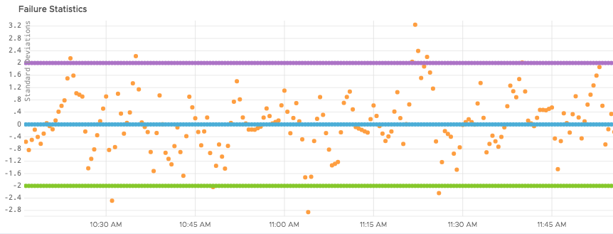
Anomaly Detection Tab
For more information about anomaly detection, see Anomaly Detection on Charts
| Option | Description |
|---|---|
| Display Settings | Filter out all the series that don’t have anomalies. This is useful for visualizing series with anomalies better. |
| Historical Sample Size | Define the size of the history window where chart forecasting is done, such as one day, one week or a month. |
| Anomaly Type | Filter out anomalies that are lower or higher than expected, or both. |
| Sensitivity | Define the sensitivity, where high sensitivity means that there’s a 67% chance that the data is anomalous, medium means there’s a 95% chance, and low means there’s a 99.7% chance. |
 |
Point Plot Chart
A point plot chart displays point buckets without any interpolation. Like a line chart, the X-axis represents the amount of time in your time window, and the Y-axis represents the value associated with the data during that time window.
Format Tab
| Option | Description |
|---|---|
| Summarization | The summarization option is used by the query engine to aggregate raw data points into displayable values. Consider the following example. The horizontal scale for your chart is "240 point buckets across, 1 bucket – 30 sec (est)". If you choose Median, the query engine aggregates the raw data values reported in each 30-second interval and displays the median value as the data point for that bucket. |
| Display Source Events | If checked, displays events that were generated by alerts associated with any source displayed on the chart. You can also use events() queries to Display events in charts. |
| Decimal Precision | How many digits to show after the decimal point. Defaults to 3. |
Axis Tab
The Axis tab lets you customize the Y axis. The customization is the same for both Line Plot and Point Plot. See Use a Logarithmic Y Axis for Skewed Data and Use IEC/Binary Prefixes in Y Axes and Legends for instructions.
| Option | Description |
|---|---|
| Y-Axis | Scale of the Y-axis: linear or logarithmic. Default is linear. In most cases, linear is sufficient as long as there is not a large difference in measurement between the reported data points. If there's a large difference in measurement scale, use the logarithmic scale. By default, the logarithmic scale is set to the power of 10. You can configure the scale in the adjacent text field. |
| Min/Max | Minimum and maximum value on the Y-axis. If you are using a double Y-axis, you can specify min/max values for each Y-axis (By default, set to auto). |
| Unit | Unit of measurement to assign to the label that appears along the Y-axis. This unit does not change the unit of measurement. If you are using a double Y-axis, you can specify a unit for each Y-axis.
Supported units are:
If you select IEC/Binary Unit Prefixes, then the chart uses 1024 instead of 1000 as the step to the next unit prefix. For details on unit prefixes and dynamic units, see Units in Chart Axes and Legends. |
Legend Tab
Controls the legend displayed for the chart by default. The options are the same for line plot and point plot charts.
When you look at the chart, you can also control the legend with these keyboard shortcuts:
- Shift+P – Pin the legend.
- Shift – Show detailed units in the legend.
| Option | Description |
|---|---|
| Options | Supports these options:
|
| Position | Position of the fixed legend. |
| Display | The values and statistics to display in the legend: current, mean, median, sum, min, max, and count. |
| Filter | The value and number of metrics displayed in the legend. Specify:
|
| Point Tag Display Options | Offers these options:
|
Drilldown Link Tab
Allows you to specify a target dashboard that displays when a user clicks on the chart. You can optionally pass in a dashboard variable or a constant. For example, you can specify a constant us-west-2 to be used as a variable in the target dashboard. See How Do Drilldown Links Work for details.
Description Tab
| Chart description which shows up as hover text when users move the mouse over the chart name. | |
Advanced Tab
| Option | Description |
|---|---|
| Include Obsolete Metrics | Select this check box to display obsolete metrics. Selecting this option is useful if you are looking at old data; however, performance is slower when this option is turned on. |
| Override No Data Message | You can customize the No Data message on a chart when there is no data in the current time window and there's no error in your query. Optionally, you can select to display the link to Troubleshooting Missing Data. |
| Chart Time Window | You can set the time window on a chart to be defined on a dashboard level, or you can set a fixed time window on a chart. When you set a fixed time window on a chart and you edit the dashboard time window, the time settings of the chart will not be affected. |
|
Stacked Area Chart

A stacked area chart is similar to a line chart, but each line is filled in as a solid block with blocks stacked on top of each other.
The stacked area chart can help you determine at a glance which queries have the largest magnitude at any point in time. It is most commonly used to visually compare two or more quantities.
Format Tab
| Option | Description |
|---|---|
| Summarization | The summarization option is used by the query engine to aggregate raw data points into displayable values. Consider the following example. The horizontal scale for your chart is "240 point buckets across, 1 bucket – 30 sec (est)". If you choose Median, the query engine aggregates the raw data values reported in each 30-second interval and displays the median value as the data point for that bucket. |
| Display Source Events | If checked, displays events that were generated by alerts associated with any source displayed on the chart. You can also use events() queries to Display events in charts. |
| Gap Threshold | Controls when data is considered missing when there are gaps in the reporting of the data. The gap threshold is expressed in seconds and defaults to 60 seconds. Data considered missing based on the threshold are shown as dotted lines. |
| Stack Type |
The following stack types are supported.
|
| Decimal Precision | How many digits to show after the decimal point. Defaults to 3. |
Axis Tab
The Axis tab lets you customize the Y axis. The customization is the same for both Line Plot and Point Plot. See Use a Logarithmic Y Axis for Skewed Data and Use IEC/Binary Prefixes in Y Axes and Legends for instructions.
| Option | Description |
|---|---|
| Y-Axis | Scale of the Y-axis: linear or logarithmic. Default is linear. In most cases, linear is sufficient as long as there is not a large difference in measurement between the reported data points. If there's a large difference in measurement scale, use the logarithmic scale. By default, the logarithmic scale is set to the power of 10. You can configure the scale in the adjacent text field. |
| Min/Max | Minimum and maximum value on the Y-axis. If you are using a double Y-axis, you can specify min/max values for each Y-axis (By default, set to auto). |
| Unit | Unit of measurement to assign to the label that appears along the Y-axis. This unit does not change the unit of measurement. If you are using a double Y-axis, you can specify a unit for each Y-axis.
Supported units are:
If you select IEC/Binary Unit Prefixes, then the chart uses 1024 instead of 1000 as the step to the next unit prefix. For details on unit prefixes and dynamic units, see Units in Chart Axes and Legends. |
Legend Tab
Controls the legend displayed for the chart by default. The options are the same for line plot and point plot charts.
When you look at the chart, you can also control the legend with these keyboard shortcuts:
- Shift+P – Pin the legend.
- Shift – Show detailed units in the legend.
| Option | Description |
|---|---|
| Options | Supports these options:
|
| Position | Position of the fixed legend. |
| Display | The values and statistics to display in the legend: current, mean, median, sum, min, max, and count. |
| Filter | The value and number of metrics displayed in the legend. Specify:
|
| Point Tag Display Options | Offers these options:
|
Drilldown Link Tab
Allows you to specify a target dashboard that displays when a user clicks on the chart. You can optionally pass in a dashboard variable or a constant. For example, you can specify a constant us-west-2 to be used as a variable in the target dashboard. See How Do Drilldown Links Work for details.
Description Tab
| Chart description which shows up as hover text when users move the mouse over the chart name. | |
Advanced Tab
| Option | Description |
|---|---|
| Include Obsolete Metrics | Select this check box to display obsolete metrics. Selecting this option is useful if you are looking at old data; however, performance is slower when this option is turned on. |
| Override No Data Message | You can customize the No Data message on a chart when there is no data in the current time window and there's no error in your query. Optionally, you can select to display the link to Troubleshooting Missing Data. |
| Chart Time Window | You can set the time window on a chart to be defined on a dashboard level, or you can set a fixed time window on a chart. When you set a fixed time window on a chart, when you edit the dashboard time window, the time settings of the chart will not be affected. |
|
Stacked Column Chart

A stacked column chart resembles a bar chart and lets you view your data in columns.
This chart supports the same tabs and options as the Stacked Area Chart discussed above but does not allow you to specify a Stack Type in the Format tab.
Format Tab
| Option | Description |
|---|---|
| Summarization | The summarization option is used by the query engine to aggregate raw data points into displayable values. Consider the following example. The horizontal scale for your chart is "240 point buckets across, 1 bucket – 30 sec (est)". If you choose Median, the query engine aggregates the raw data values reported in each 30-second interval and displays the median value as the data point for that bucket. |
| Display Source Events | If checked, displays events that were generated by alerts associated with any source displayed on the chart. You can also use events() queries to Display events in charts. |
| Gap Threshold | Controls when data is considered missing when there are gaps in the reporting of the data. The gap threshold is expressed in seconds and defaults to 60 seconds. Data considered missing based on the threshold are shown as dotted lines. |
| Decimal Precision | How many digits to show after the decimal point. Defaults to 3. |
Axis Tab
The Axis tab lets you customize the Y axis. The customization is the same for both Line Plot and Point Plot. See Use a Logarithmic Y Axis for Skewed Data and Use IEC/Binary Prefixes in Y Axes and Legends for instructions.
| Option | Description |
|---|---|
| Y-Axis | Scale of the Y-axis: linear or logarithmic. Default is linear. In most cases, linear is sufficient as long as there is not a large difference in measurement between the reported data points. If there's a large difference in measurement scale, use the logarithmic scale. By default, the logarithmic scale is set to the power of 10. You can configure the scale in the adjacent text field. |
| Min/Max | Minimum and maximum value on the Y-axis. If you are using a double Y-axis, you can specify min/max values for each Y-axis (By default, set to auto). |
| Unit | Unit of measurement to assign to the label that appears along the Y-axis. This unit does not change the unit of measurement. If you are using a double Y-axis, you can specify a unit for each Y-axis.
Supported units are:
If you select IEC/Binary Unit Prefixes, then the chart uses 1024 instead of 1000 as the step to the next unit prefix. For details on unit prefixes and dynamic units, see Units in Chart Axes and Legends. |
Legend Tab
Controls the legend displayed for the chart by default. The options are the same for line plot and point plot charts.
When you look at the chart, you can also control the legend with these keyboard shortcuts:
- Shift+P – Pin the legend.
- Shift – Show detailed units in the legend.
| Option | Description |
|---|---|
| Options | Supports these options:
|
| Position | Position of the fixed legend. |
| Display | The values and statistics to display in the legend: current, mean, median, sum, min, max, and count. |
| Filter | The value and number of metrics displayed in the legend. Specify Top or Bottom and then select the number (e.g., 5 to show the top 5 time series) and, optionally, an evaluation filter. |
| Point Tag Display Options | Offers these options:
|
Drilldown Link Tab
Allows you to specify a target dashboard that displays when a user clicks on the chart. You can optionally pass in a dashboard variable or a constant. For example, you can specify a constant us-west-2 to be used as a variable in the target dashboard. See How Do Drilldown Links Work for details.
Description Tab
| Chart description which shows up as hover text when users move the mouse over the chart name. | |
Advanced Tab
| Option | Description |
|---|---|
| Include Obsolete Metrics | Select this check box to display obsolete metrics. Selecting this option is useful if you are looking at old data; however, performance is slower when this option is turned on. |
| Override No Data Message | You can customize the No Data message on a chart when there is no data in the current time window and there's no error in your query. Optionally, you can select to display the link to Troubleshooting Missing Data. |
| Chart Time Window | You can set the time window on a chart to be defined on a dashboard level, or you can set a fixed time window on a chart. When you set a fixed time window on a chart, when you edit the dashboard time window, the time settings of the chart will not be affected. |
|
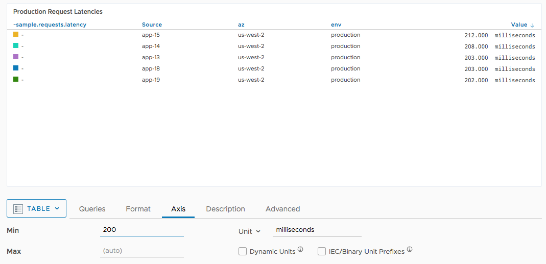
Table Chart
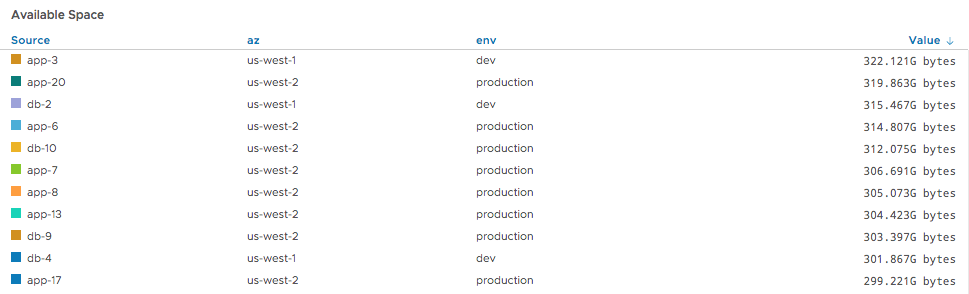
A table chart allows fine-grained customization in the Format tab but doesn’t support changes to the legend.
Format Tab
| Option | Description |
|---|---|
| Summarization | Each line in a table chart reports a summarized value of all available data points for the current time window. The summarization option determines how these values are calculated. |
| Show Raw Values | Select to display the raw metric values (e.g., 212.00 milliseconds) or values using scientific notation (SI), e.g., 212 milliseconds. |
| Sort Values Descending | Check to sort values descending (largest to smallest) or ascending (smallest to largest). |
| Decimal Precision | How many digits to show after the decimal point. Defaults to 3. |
Axis Tab
The Axis tab of a table chart allows you to limit which values show up in the chart. Consider this example table, which users have to scroll:
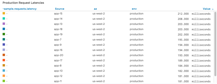
You can specify a minimum of 200 milliseconds to show only values of interest:
| Option | Description |
|---|---|
| Min/Max | The minimum and maximum value. |
| Unit | The unit of measurement to assign to the reported chart values label that appears along the Y-axis of the chart. This unit is merely a label and does not change the unit of measurement.
The supported units are:
If you select IEC/Binary Unit Prefixes, then the chart uses 1024 instead of 1000 as the step to the next unit prefix. For details on unit prefixes and dynamic units, see Units in Chart Axes and Legends. |
Columns Tab
Allows you to select which columns to see in the table chart.
| Option | Description |
|---|---|
| Show Sources | Select to display the sources in the table. |
| Show Labels | Select to display labels in the table. A label is the metric name associated with the data or the query expression resulting from an aggregation. |
| Group by Sources | Whether to group the column results by source. If you select Group by Source, the table lists the grouped sources in the first column and the values for each metric in separate columns. |
| Point Tag Columns to Display | Allows you to show all point tags, only a selected number, or only metrics with a certain tag key. |
| Show Value Column | Allows you to show or hide the Value column according to your needs.
|
Drilldown Link Tab
Allows you to specify a target dashboard that displays when a user clicks on the chart. You can optionally pass in a dashboard variable or a constant. For example, you can specify a constant us-west-2 to be used as a variable in the target dashboard. See How Do Drilldown Links Work for details.
Description Tab
| Chart description which shows up as hover text when users move the mouse over the chart name. | |
Advanced Tab
| Option | Description |
|---|---|
| Include Obsolete Metrics | Select this check box to display obsolete metrics. Selecting this option is useful if you are looking at old data; however, performance is slower when this option is turned on. |
| Override No Data Message | You can customize the No Data message on a chart when there is no data in the current time window and there's no error in your query. Optionally, you can select to display the link to Troubleshooting Missing Data. |
| Chart Time Window | You can set the time window on a chart to be defined on a dashboard level, or you can set a fixed time window on a chart. When you set a fixed time window on a chart, when you edit the dashboard time window, the time settings of the chart will not be affected. |
|
Markdown Chart
A Markdown chart allows you to provide in-depth text descriptions of a dashboard and individual charts using Markdown. We support CommonMark
In addition to Markdown formatted text, you can use links, images hosted at a location of your choice, and dashboard variables. You can refer to the value of a dashboard variable with the query variable syntax ${var_name} and the label of the variable using %{var_name}. Using a label instead of the variable value could be useful for list variables that might show the dropdown labels such as: Any, 1 Year, 3 Years which could map to opaque values such as -1, 1, 3.
You can pass a time window as a parameter in markdown. For example, when you create a dynamic link in a markdown chart, from the time selector you can pick a specific time window. When you click the link on the markdown chart, you will see the chart within the current time range that you’ve selected.
When you add a markdown chart with a dashboard dynamic link to an existing dashboard, for example, [[dashboardURLWithCurrentTimeRange url=/tracing/service/details title=MyChart]], clicking the link on the markdown chart, will open a dashboard within the time range that is specified in the parent dashboard, i.e. the dashboard to which you’ve added the markdown chart.
|
Single Stat Chart

By default, a single stat chart plots a single series on a chart and displays a summarized value for that series in large font on the chart. The font size and placement of the displayed value can be unique for each chart. A common use case is displaying instantaneous values of critical metrics on an overhead display.
Format Tab
| Option | Description |
|---|---|
| Summarization | The summarization option is used by the query engine to aggregate raw data points into displayable values. Consider the following example. The horizontal scale for your chart is "240 point buckets across, 1 bucket – 30 sec (est)". If you choose Median, the query engine aggregates the raw data values reported in each 30-second interval and displays the median value as the data point for that bucket. |
| Display Value | Allows you to show the value or the query label. Initially, labels are consecutive starting at A. |
| Display Subtitle | Optional subtitle below the value (or label). |
| Decimal Precision | How many digits to show after the decimal point. Defaults to 3. |
| Horizontal Position | Allows you to set the alignment to Left, Middle, or Right |
| Font Size | Relative font size from 75% to 200%. |
| Text Color | Color of the value or label text displayed in the chart. |
| Prefix | Allows you to prefix the value (or label) with a text string. For example, you could show the source or environment. |
| Postfix | Allows you to append text to the value (or label). For example, you could show the source or environment. |
| Value/Text Mapping | Allows you show the text lower, middle, or upper instead of the value itself. |
| Gap Threshold | Controls when data is considered missing when there are gaps in the reporting of the data. The gap threshold is expressed in seconds and defaults to 60 seconds. |
| Display Raw Value | Select this check box if you've selected a unit and you want to display, for example, 10k instead of 10000. Selected by default. |
| Comma Delimited | Select this check box if you've selected a unit and you want to display, for example, 1,000 instead of 1000. Works only for values higher than or equal to 1000 and is selected by default. |
Sparkline Tab
The sparkline on a single stat chart summarizes the series display. You can customize the sparkline with these options:
| Option | Description |
|---|---|
| Show Sparkline |
Whether and where to show the sparkline. Options are:
|
| Show Single Line Gradient | Allows you to turn off or turn on the single line color gradient. |
| Sparkline Color | Color of the sparkline. Click the X to return the color to the default (blue). |
| Fill Color | Fill color for the sparkline background or text. |
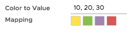
| Color to Value Mapping | Allows you to specify a set of values and map them to colors. For example, this mapping shows yellow for values under 10, green for values between 10 and 20, etc. Click any color to customize it.
|
| Axis | Allows you to select a linear or logarithmic axis for the sparkline. See Use a Logarithmic Y Axis for Skewed Data. |
| Min/Max | Minimum and maximum value on the Y-axis of the sparkline. |
Drilldown Link Tab
The Drilldown Link tab allows you to specify a target dashboard that displays when a user clicks on the single stat chart. You can optionally customize the target dashboard. For example, you can specify a constant us-west-2 to be used as a variable.
|
Description Tab
| Chart description which shows up as hover text when users move the mouse over the chart name. | |
Advanced Tab
| Option | Description |
|---|---|
| Include Obsolete Metrics | Select this check box to display obsolete metrics. Selecting this option is useful if you are looking at old data; however, performance is slower when this option is turned on. |
| Override No Data Message | You can customize the No Data message on a chart when there is no data in the current time window and there's no error in your query. Optionally, you can select to display the link to Troubleshooting Missing Data. |
| Chart Time Window | You can set the time window on a chart to be defined on a dashboard level, or you can set a fixed time window on a chart. When you set a fixed time window on a chart, when you edit the dashboard time window, the time settings of the chart will not be affected. |
Topk Chart

A topk chart shows the most critical time series (8 by default) as horizontal bars. You can
- Add a color mapping to highlight values
- Specify the number of bars and other details such as the bar label, bar header, etc.
- Specify a drilldown link that directs users to a different dashboard when they click on a bar.
Color Mapping Tab
The color mapping tab lets you define which set of values maps to which colors. In the example above, values under 0.5 are mapped to orange, values 0.5 - 1.0 are mapped to blue. See How Do I Set Up Color Mapping for details.
Format Tab
| Option | Description |
|---|---|
| Summarization | The summarization option is used by the query engine to aggregate raw data points into displayable values. Consider the following example. The horizontal scale for your chart is "240 point buckets across, 1 bucket – 30 sec (est)". If you choose Median, the query engine aggregates the raw data values reported in each 30-second interval and displays the median value as the data point for that bucket. |
| Number of Bars | Sets the number of bars for this topk chart. Default is 8. |
| Group By | Groups the bars. Source is included by default and cannot be removed. |
| Bar Label | Label shown on the very left of each bar. Default is source. In the example above, sources include app-3, db-1, etc. |
| Bar Header | Header for all bars, show in the top left. In the example above, source. |
| Value Header | Header for the value column, shown in the top right. In the example above, value. |
| Decimal Precision | Decimal precision of the value. Default is 3. |
| Min and Max | Allows you to specify the minimum and maximum and the units. |
| Sort Values Descending | If checked, the highest values are at the top. If unchecked, the lowest values are at the top. |
Drilldown Link Tab
Allows you to direct end users to a target dashboard if they click this chart. See How Do Drilldown Links Work for details.
|
Description Tab
| Chart description which shows up as hover text when users move the mouse over the chart name. | |
Advanced Tab
| Option | Description |
|---|---|
| Include Obsolete Metrics | Select this check box to display obsolete metrics. Selecting this option is useful if you are looking at old data; however, performance is slower when this option is turned on. |
| Override No Data Message | You can customize the No Data message on a chart when there is no data in the current time window and there's no error in your query. Optionally, you can select to display the link to Troubleshooting Missing Data. |
| Chart Time Window | You can set the time window on a chart to be defined on a dashboard level, or you can set a fixed time window on a chart. When you set a fixed time window on a chart, when you edit the dashboard time window, the time settings of the chart will not be affected. |
Node Map Chart

A node map chart shows colored 3-D cubes ordered from highest to lowest. Node maps show data based on source values.
- By default, the node map displays the highest value on the top left to catch the user’s eye.
- When a user clicks a node, a small popup of the corresponding metric for that source results. You might have to modify the query to ensure that the query returns a source. In some cases, it’s necessary to use
aliasSource()to get the desired results. - Use color mapping to determine colors for higher values. The node map uses shading to show transitions. In the example above, values below 0.1 are shown in yellow, values below 0.2 are shown as green, values between 0.2 and 0.4 are shown as a shade of brown.
- Set the group and the metric to display in the top right or on the Node Map Defaults tab in the chart editor.
- Set the maximum number of node groups to display on the Node Map Defaults tab. The highest number is 35.
- Specify a drilldown link to direct users to a different dashboard if they click on the dashboard.
When you refresh a node map page, a short animation folds out the chart content.
Color Mapping Tab
The color mapping tab lets you define which set of values maps to which colors. In the example above, values less than 0.3 are green, values less than 0.8 are yellow. All other values are red. See How Do I Set Up Color Mapping for details.
Node Map Defaults Tab
| Option | Description |
|---|---|
| Max Node Group Count | Specifies the maximum number of node groups to display. You can select 10, 15, 20, 25, 30, or 35 node groups to display on the chart. The default is 10. In the example above, the maximum number of node groups is set to 15 and 11 groups are displayed. |
| Default Group by | Specifies grouping. |
| Default Metric | Metric you're interested in. Each cube in the node map displays one node and you can, for example, create a set of queries to monitor for CPU, memory, and bandwidth issues. |
| Node Title Tag | Lets you set the title of the popup line chart to the source (default) or one of the point tags. |
| Default Node Color | Lets you pick the color of nodes with values that are below any of the thresholds. |
Drilldown Link Tab
If you specify a drilldown link, end users are directed to a target dashboard when they click this chart. You can optionally pass a point tag, variable, or other value into the target dashboard to customize it for the user ahead of time. See How Do Drilldown Links Work for details.
|
Description Tab
| Chart description which shows up as hover text when users move the mouse over the chart name. | |
Advanced Tab
| Option | Description |
|---|---|
| Include Obsolete Metrics | Select this check box to display obsolete metrics. Selecting this option is useful if you are looking at old data; however, performance is slower when this option is turned on. |
| Override No Data Message | You can customize the No Data message on a chart when there is no data in the current time window and there's no error in your query. Optionally, you can select to display the link to Troubleshooting Missing Data. |
| Chart Time Window | You can set the time window on a chart to be defined on a dashboard level, or you can set a fixed time window on a chart. When you set a fixed time window on a chart, when you edit the dashboard time window, the time settings of the chart will not be affected. |
Histogram Chart

Histogram charts have two main uses:
- Visualize actual histograms. Our histograms let you compute, store, and use distributions of metrics rather than single metrics. Histograms are useful for high-velocity metrics about your applications and infrastructure – particularly those gathered across many distributed sources.
- Display a histogram visualization of a time series. That makes it possible, for example, to easily see query results above a certain percentile.
You can zoom in to the histogram as needed by selecting a region.
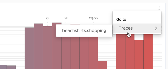
The histogram chart shows the aggregate view of the entire window. For both histogram data and time series data, you can visualize the amount of data in a certain percentile, specify color gradient and axis information, and, most importantly, get details about your histogram data by looking at hover text on each bar.
From the chart’s edit menu, you can go to the corresponding trace (if any).
Data Tab
In contrast to other chart types, you must use the query editor to enter histogram information.
One easy way to show a histogram is from the Histogram browser.
- Select Browse > Histograms
- Drill down to the metric you’re interested in and double-click it to open it in a chart.
You must make sure you’re looking at a metric – it doesn’t make sense to select a folder.
Format Tab
| Option | Description |
|---|---|
| Color Gradient | Lets you select a start and end color for the histogram gradient. |
| Percentile Markers | Display predefined percentile makers as numbers on the chart. |
| Threshold | A threshold marker for the data represented by the chart. Can be either a constant value or a variable that is defined by a query. |
Axis Tab
The Axis tab lets you change the Y axis, and both the X axis dimensions and units.
| Option | Description |
|---|---|
| Y-Axis | Scale of the Y-axis: linear or logarithmic. Default is linear. In most cases, linear is sufficient as long as there is not a large difference in measurement between the reported data points. If there's a large difference in measurement scale, use the logarithmic scale. By default, the logarithmic scale is set to the power of 10. You can configure the scale in the adjacent text field. |
| Min/Max | Y axis minimum and maximum value. Use these two options to change the height of your histogram bars. |
| X-Axis Min / X-Axis Max | Allows you to specify the minimum and maximum on the X axis, in effect, filtering out some of the left-most and right-most bars that the chart displays. |
| Unit | Unit of measurement to assign to the label that appears along the X-axis. This unit does not change the unit of measurement. This unit also does not affect the Y axis.
Supported units are:
If you select IEC/Binary Unit Prefixes, then the chart uses 1024 instead of 1000 as the step to the next unit prefix. For details on unit prefixes and dynamic units, see Units in Chart Axes and Legends. |
Advanced Tab
| Option | Description |
|---|---|
| Include Obsolete Metrics | Select this check box to display obsolete metrics. Selecting this option is useful if you are looking at old data; however, performance is slower when this option is turned on. |
| Override No Data Message | You can customize the No Data message on a chart when there is no data in the current time window and there's no error in your query. Optionally, you can select to display the link to Troubleshooting Missing Data. |
| Chart Time Window | You can set the time window on a chart to be defined on a dashboard level, or you can set a fixed time window on a chart. When you set a fixed time window on a chart, when you edit the dashboard time window, the time settings of the chart will not be affected. |
|
Heat Map Chart

Heat map charts add another dimension to the information about histograms that you see in a histogram chart.
- The X axis shows time (same as a line plot)
- The Y axis shows distribution values (just like the X axis in histogram charts). This is what you’re recording, for example, latency.
- The color saturation shows the amount of data for the selected time frame.
Data Tab
In most cases, it makes sense to do an hs() query in the Query Editor.
One easy way to show which histograms are on your cluster is from the Histogram browser.
- Select Browse > Histograms
- Drill down to the metric you’re interested in and double-click it to open it in a chart. You must make sure you’re looking at a metric – it doesn’t make sense to select a folder.
Format Tab
| Option | Description |
|---|---|
| Display Source Events | When checked, shows events associated with any source related to the data in the X axis. |
| Color | Base color for the heat map. The saturation of the color indicates the count for the selected field. Hover over any field to see a vertical histogram as a legend that you can pin with Shift+P. The histogram highlights the vertical line that corresponds to the grid cell you've selected. |
| Threshold | A threshold marker for the data represented by the chart. Can be either a constant value or a variable that is defined by a query. |
Axis Tab
The Axis tab lets you change the Y axis, and both the X axis and Y axis dimensions and units.
| Option | Description |
|---|---|
| Y-Axis Min/Max | Y axis minimum and maximum value. |
| Y Axis Unit | Unit of measurement to assign to the label that appears along the Y-axis. For example, select Dynamic Units and then change to microseconds. This option does not change the unit of measurement.
Supported units are:
If you select IEC/Binary Unit Prefixes, then the chart uses 1024 instead of 1000 as the step to the next unit prefix. For details on unit prefixes and dynamic units, see Units in Chart Axes and Legends. |
| Y-Axis Bucket Count/X Axis Bucket Count | The size of each bucket. For the X axis, the bucket count is also shown right below the chart itself. |
Advanced Tab
| Option | Description |
|---|---|
| Include Obsolete Metrics | Select this check box to display obsolete metrics. Selecting this option is useful if you are looking at old data; however, performance is slower when this option is turned on. |
| Override No Data Message | You can customize the No Data message on a chart when there is no data in the current time window and there's no error in your query. Optionally, you can select to display the link to Troubleshooting Missing Data. |
| Chart Time Window | You can set the time window on a chart to be defined on a dashboard level, or you can set a fixed time window on a chart. When you set a fixed time window on a chart, when you edit the dashboard time window, the time settings of the chart will not be affected. |
|
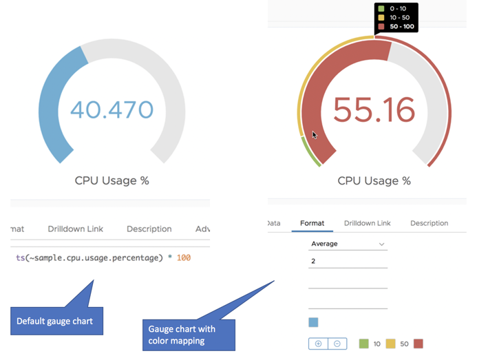
Gauge Chart
A gauge chart displays a single value, in a default color. You can optionally add color mapping. If you do, the which displays in an outer ring. By default, color mapping uses 0-100, but you can define a minimum and maximum.
Format Tab
| Option | Description |
|---|---|
| Summarization | The summarization option is used by the query engine to aggregate raw data points into displayable values. Consider the following example. The horizontal scale for your chart is "240 point buckets across, 1 bucket – 30 sec (est)". If you choose Median, the query engine aggregates the raw data values reported in each 30-second interval and displays the median value as the data point for that bucket. |
| Decimal Precision | How many digits to show after the decimal point. Defaults to 3. |
| Prefix | Allows you to prefix the value (or label) with a text string. For example, you could show the source or environment. The font of the prefix is smaller than the display font. |
| Postfix | Allows you to append text to the value (or label). For example, you could add the unit of measurement. |
| Default Color | Color that's used for the value and the gauge ring when no color mapping is defined. Default is blue. See the chart on the left in the image above. |
| Color Mapping | Adds an outer ring and splits that outer ring into color zones that show possible values of the gauge. See the chart on the right in the image above. By default, the gauge displays color information for 0-100 even if you define a mapping for a different range. Specify Min and Max to change what the outer ring shows. See Why Doesn't the Outer Ring of My Gauge Change? |
| Min | Minimum value to use for the outer ring of the gauge. If no color mapping is defined, the gauge ranges from Min to Max. With color mapping defined, the outer ring is also affected. |
| Max | Maximum value to use for the outer ring of the gauge. If no color mapping is defined, the gauge ranges from Min to Max. With color mapping defined, the outer ring is also affected. |
| Display Raw Value | Select this check box if you've selected a unit and you want to display, for example, 10k instead of 10000. Selected by default. |
Drilldown Link Tab
The Drilldown Link tab allows you to specify a target dashboard that displays when a user clicks on the gauge chart. You can optionally customize the target dashboard. For example, you can specify a constant us-west-2 to be used as a variable.
Description Tab
| Chart description which shows up as hover text when users move the mouse over the chart name. | |
Advanced Tab
| Option | Description |
|---|---|
| Include Obsolete Metrics | Select this check box to display obsolete metrics. Selecting this option is useful if you are looking at old data; however, performance is slower when this option is turned on. |
| Override No Data Message | You can customize the No Data message on a chart when there is no data in the current time window and there's no error in your query. Optionally, you can select to display the link to Troubleshooting Missing Data. |
| Chart Time Window | You can set the time window on a chart to be defined on a dashboard level, or you can set a fixed time window on a chart. When you set a fixed time window on a chart, when you edit the dashboard time window, the time settings of the chart will not be affected. |
|
Pie and Donut Chart

A pie chart shows the relative size of your data as pie slices. You can show either a pie chart or a donut chart. You can customize the width of the donut ring (by percentage) and, the percentile shown for the number, and more.
The collage above shows both a pie chart and a donut chart for the same data.
Format Tab
| Option | Description |
|---|---|
| Type | Select a pie chart or donut chart. If you pick a donut chart, you can set a ratio to make the ring thicker or thinner. |
| Summarization | The summarization option is used by the query engine to aggregate raw data points into displayable values. Consider the following example. The horizontal scale for your chart is "240 point buckets across, 1 bucket – 30 sec (est)". If you choose Median, the query engine aggregates the raw data values reported in each 30-second interval and displays the median value as the data point for that bucket. |
| Display Value |
Select a value you want to display on the chart. You see the values as a percentage.
For example, if the query you use gets the CPU usage of all the applications, and you select Sum, you can see how the CPU usage of an application compares to all the other applications for a given time window.
|
| Show Percentage | Let's you show percentage labels for your chart. |
| Decimal Precision | How many digits to show after the decimal point for the percentage and for the value. |
| Group Slices | Allows you to specify the maximum number of slices for the chart. If there are more slices than the maximum, the values of all other slices are combined and have the label "Other" by default. You can change that label. |
| Slice Colors | The colors for the different slices. You can click each color and change it. To revert your changes, click Reset to Default Colors. |
| Min | Allows you to filter the chart by value. Only values greater than or equal to Min are shown. |
| Max | Allows you to filter the chart by value. Only values smaller than or equal to Max are shown. |
Legend Tab
Controls the legend displayed for the chart.
When you look at the chart, you can also control the legend with these keyboard shortcuts:
- Shift+P – Pin the legend.
- Shift – Show detailed units in the legend.
| Option | Description |
|---|---|
| Options | You can select all or none of the Legend options.
|
| Position | Position of the fixed legend. |
| Display | The values and statistics to display in the legend: current, mean, median, sum, min, max, and count. |
| Filter | The value and number of metrics displayed in the legend. Specify:
|
| Show Source Name | Add or remove the source name data from the fixed legend. |
| Show Metric Name | Add or remove the metrics name data from the fixed legend. |
| Point Tag Display Options | Offers these options:
|
Drilldown Link Tab
The Drilldown Link tab allows you to specify a target dashboard that displays when a user clicks on the chart. You can optionally customize the target dashboard. For example, you can specify a constant us-west-2 to be used as a variable.
Description Tab
| Chart description which shows up as hover text when users move the mouse over the chart name. | |
Advanced Tab
| Option | Description |
|---|---|
| Include Obsolete Metrics | Select this check box to display obsolete metrics. Selecting this option is useful if you are looking at old data; however, performance is slower when this option is turned on. |
| Override No Data Message | You can customize the No Data message on a chart when there is no data in the current time window and there's no error in your query. Optionally, you can select to display the link to Troubleshooting Missing Data. |
| Chart Time Window | You can set the time window on a chart to be defined on a dashboard level, or you can set a fixed time window on a chart. When you set a fixed time window on a chart, when you edit the dashboard time window, the time settings of the chart will not be affected. |
|
Logs Table
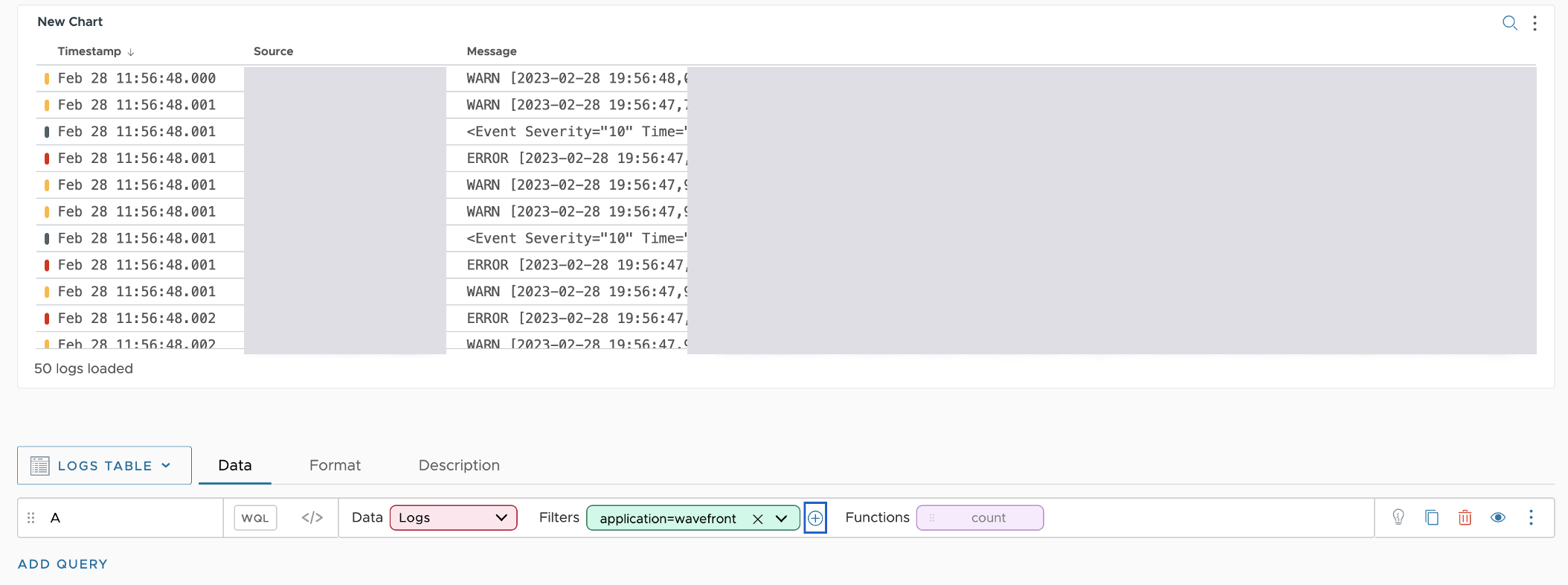
The logs chart lists the logs sent to the service. Use one or more filters to filter the logs, and save the chart to see the data you want. If you want to customize the query data once the chart is saved and drill into logs, use the Logs Browser.
Format Tab
| Option | Description |
|---|---|
| Sort by Timestamp | By default, you see the latest logs on the top of the table (Descending). If you want to see the oldest logs, select Ascending. |
| Number of Message Lines | Select the number of log lines you want to see in the Message column to get a better preview of the log message. |
| Scroll to Autoload Logs | You can decide how you want to load the results in the logs table. By default, scroll auto-load is enabled and logs load as you scroll through the logs table. If scroll auto-load is disabled, to load the next set of results, you must click Load More Results. |
| Columns to Show in Table | Each log has required attributes, standard attributes, and custom tags. We tokenize the values of these attributes and tags so that you can filter and search logs. For more details, see Log Attributes. Select the tags you want to see the values in a new column. |
Description Tab
| Chart description which shows up as hover text when users move the mouse over the chart name. |  |
|
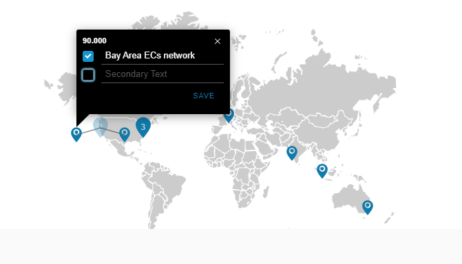
Geo Map Chart

You can use the Geo Map chart to visualize your ingested data by location. Currently, the Geo Map chart allows you to visualize data ingested by a cloud provider, such as Amazon Web Services, Microsoft Azure, Google Cloud Platform, and so on. The location information is based on the cloud provider regions that are sent as metric tags, such as Region or Zone.
To view the information by location, on the Map View tab, from the Tag Keys drop-down menu, you must always select a tag key, for example Region.
When you hover over a pin on the chart or click it, you see a pop-up with the query value for the respective zone. You can edit the pop-up and add text with more information that is important to you.
To add primary and secondary texts:
|
 |
Format Tab
| Option | Description |
|---|---|
| Summarization | The summarization option is used by the query engine to aggregate raw data points into displayable values. |
| Color to Value Mapping | Allows you to specify a set of values and map them to colors. For example, this mapping shows yellow for values under 10, green for values between 10 and 20, etc. Click any color to customize it.
|
Map View Tab
| Option | Description |
|---|---|
| Default Metric | Allows you to switch between the queries in your chart. You can also use the Metric drop-down menu displayed in the top right corner of the chart. |
| View set box | Allows you to select a region and zoom into it.
|
| Tag Keys | Allows you to select and add tag keys to the map chart. You must always select a tag key, such as Region. |
Drilldown Link Tab
Allows you to specify a target dashboard that displays when a user clicks on the chart. You can optionally pass in a dashboard variable or a constant. For example, you can specify a constant us-west-2 to be used as a variable in the target dashboard. See How Do Drilldown Links Work for details.
Description Tab
| Chart description which shows up as hover text when users move the mouse over the chart name. | |
Advanced Tab
| Option | Description |
|---|---|
| Include Obsolete Metrics | Select this check box to display obsolete metrics. Selecting this option is useful if you are looking at old data; however, performance is slower when this option is turned on. |
| Override No Data Message | You can customize the No Data message on a chart when there is no data in the current time window and there's no error in your query. Optionally, you can select to display the link to Troubleshooting Missing Data. |
| Chart Time Window | You can set the time window on a chart to be defined on a dashboard level, or you can set a fixed time window on a chart. When you set a fixed time window on a chart, when you edit the dashboard time window, the time settings of the chart will not be affected. |